Feb 4, 2025
Feb 4, 2025
Design Lab: Building NovaVR – My Journey from Figma to Code
Design Lab: Building NovaVR – My Journey from Figma to Code
Discover the creative journey behind NovaVR, a futuristic landing page inspired by sleek tech aesthetics. Follow the process of brainstorming, designing in Figma, and crafting standout visuals for a minimalist yet bold web design.
Discover the creative journey behind NovaVR, a futuristic landing page inspired by sleek tech aesthetics. Follow the process of brainstorming, designing in Figma, and crafting standout visuals for a minimalist yet bold web design.

The Best Way to Learn? By Doing.
If there’s one thing I’ve learned, it’s that the best way to get better at anything, especially designing and coding, is to just do it. Once I’m interested in something, I want to soak up as much information as possible. So in my free time (you know, when I’m not working, freelancing, studying, or being a mom 🫠), I decided to start recreating popular website designs. I’m obsessed with the new 2025 design trends, and if I want to stay ahead of the curve, I need to master the most iconic ones (you’ll get the joke in a sec).
Finding the Right Inspiration
To kick off this journey, I moseyed over to Awwwards.com (if you haven’t checked it out, you’re missing out on some dope web design inspo). After some browsing, I stumbled upon a clean, minimalist design by ICON Golf Carts (see, told you the joke was coming). I KNEW I had to recreate it. The modern layout, the fun animations, it was everything I loved about cutting-edge web design. One trend I’m particularly obsessed with is white space. It lets the focal point breathe and stand out effortlessly. The designers at ICON EV nailed it because I was instantly drawn to the bold, standout presentation of their golf carts. Plus, the snappy animations made it super engaging. I had fun sliding the carts in and out of view.

Choosing My Concept: NovaVR
With my sights set on emulating this design, I mapped out what I needed to bring my version to life. First, I needed a product. I wanted something tech-focused and modern, so I turned to Mr. GPT for some options. After sifting through a few ideas, I landed on a VR headset—perfect for generating sleek AI visuals. (Oh yeah, she makes her own graphics too 💪🏾). The AI-generated name NovaVR immediately stood out to me. It had that futuristic, high-tech vibe I was aiming for.
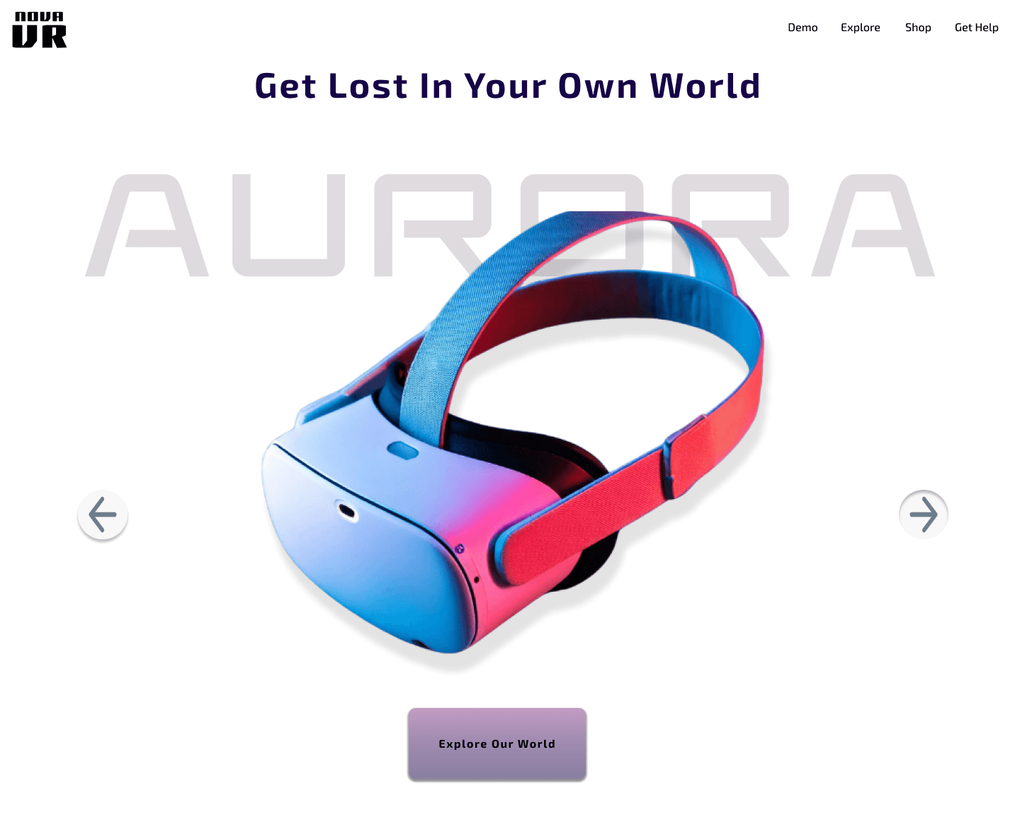
I then set out to find reference images of VR headsets to help with my AI prompts. Once I had solid inspiration, I jumped into Adobe Firefly and got to work. I tweaked my prompt over and over until I finally created Nebula and Aurora, the flagship products of NovaVR. Because I was working with a minimalist white and gray color scheme, I needed the headsets to pop. I opted for a bold pink gradient, making sure they commanded attention while keeping the aesthetic clean and modern.
Designing in Figma
Now onto the fun part, designing. Typography is a deep rabbit hole for me, and I love finding fonts that perfectly match a project’s theme. I went with Elevon, a futuristic font that gave me major Zenon: Girl of the 21st Century vibes (shoutout to my fellow Disney Channel kids). It fit the NovaVR space theme perfectly. My secondary font, Exo 2, is another futuristic, boxy typeface. Understated but sleek. It’s quickly becoming my favorite, so I look for any excuse to use it.
As a self-taught Figma user, I’ve unlocked so many amazing shortcuts just by exploring and watching tutorials, but my absolute favorite? Auto Layout. As someone with a CSS background, it makes achieving consistent spacing SO much easier. While recreating the original design, I made a couple of updates to personalize it:
Arrow Placement - I moved the arrows to either side of the product image for better usability. I completely missed the arrows in the original design at first glance.
Animation Adjustments - I slowed down the original snappy animation to create a smoother, more refined slide. I felt this better matched the vibe of an upscale tech hardware brand.
Next Up: Bringing It to Life
Once the design was finalized, I was too excited to stop there. I HAD to see it live. That meant building it from scratch. Check out my next blog post, The Making of NovaVR: Part II, where I dive into the development process, my tech stack, and the challenges I faced building this project.
The Best Way to Learn? By Doing.
If there’s one thing I’ve learned, it’s that the best way to get better at anything, especially designing and coding, is to just do it. Once I’m interested in something, I want to soak up as much information as possible. So in my free time (you know, when I’m not working, freelancing, studying, or being a mom 🫠), I decided to start recreating popular website designs. I’m obsessed with the new 2025 design trends, and if I want to stay ahead of the curve, I need to master the most iconic ones (you’ll get the joke in a sec).
Finding the Right Inspiration
To kick off this journey, I moseyed over to Awwwards.com (if you haven’t checked it out, you’re missing out on some dope web design inspo). After some browsing, I stumbled upon a clean, minimalist design by ICON Golf Carts (see, told you the joke was coming). I KNEW I had to recreate it. The modern layout, the fun animations, it was everything I loved about cutting-edge web design. One trend I’m particularly obsessed with is white space. It lets the focal point breathe and stand out effortlessly. The designers at ICON EV nailed it because I was instantly drawn to the bold, standout presentation of their golf carts. Plus, the snappy animations made it super engaging. I had fun sliding the carts in and out of view.
Choosing My Concept: NovaVR
With my sights set on emulating this design, I mapped out what I needed to bring my version to life. First, I needed a product. I wanted something tech-focused and modern, so I turned to Mr. GPT for some options. After sifting through a few ideas, I landed on a VR headset—perfect for generating sleek AI visuals. (Oh yeah, she makes her own graphics too 💪🏾). The AI-generated name NovaVR immediately stood out to me. It had that futuristic, high-tech vibe I was aiming for.
I then set out to find reference images of VR headsets to help with my AI prompts. Once I had solid inspiration, I jumped into Adobe Firefly and got to work. I tweaked my prompt over and over until I finally created Nebula and Aurora, the flagship products of NovaVR. Because I was working with a minimalist white and gray color scheme, I needed the headsets to pop. I opted for a bold pink gradient, making sure they commanded attention while keeping the aesthetic clean and modern.
Designing in Figma
Now onto the fun part, designing. Typography is a deep rabbit hole for me, and I love finding fonts that perfectly match a project’s theme. I went with Elevon, a futuristic font that gave me major Zenon: Girl of the 21st Century vibes (shoutout to my fellow Disney Channel kids). It fit the NovaVR space theme perfectly. My secondary font, Exo 2, is another futuristic, boxy typeface. Understated but sleek. It’s quickly becoming my favorite, so I look for any excuse to use it.
As a self-taught Figma user, I’ve unlocked so many amazing shortcuts just by exploring and watching tutorials, but my absolute favorite? Auto Layout. As someone with a CSS background, it makes achieving consistent spacing SO much easier. While recreating the original design, I made a couple of updates to personalize it:
Arrow Placement - I moved the arrows to either side of the product image for better usability. I completely missed the arrows in the original design at first glance.
Animation Adjustments - I slowed down the original snappy animation to create a smoother, more refined slide. I felt this better matched the vibe of an upscale tech hardware brand.
Next Up: Bringing It to Life
Once the design was finalized, I was too excited to stop there. I HAD to see it live. That meant building it from scratch. Check out my next blog post, The Making of NovaVR: Part II, where I dive into the development process, my tech stack, and the challenges I faced building this project.


